From sketch to recorded mark
Design a brand that works beyond the screen
A cattle brand has a practical job: it must remain distinct when viewed at a distance and simple enough to reproduce consistently. Use the designer to explore, then pressure-test your shortlist before you file or commission an iron.
How to design a readable cattle brand
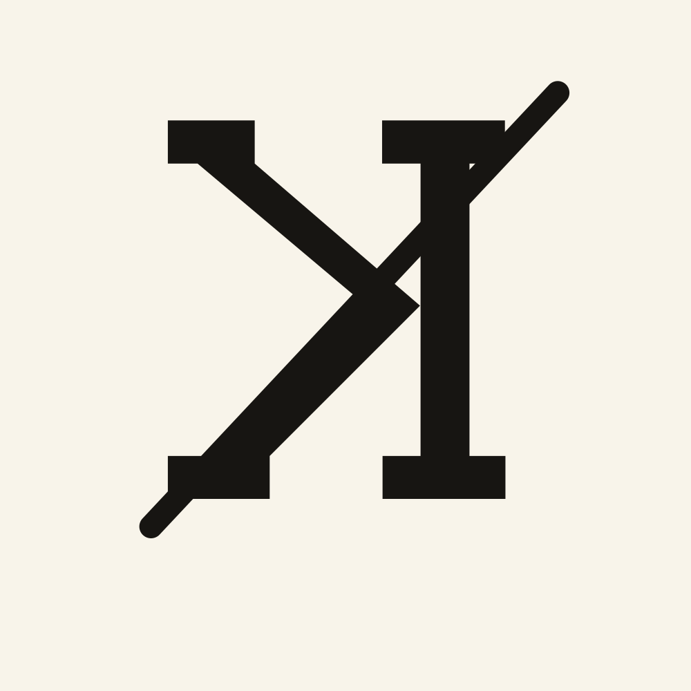
Start with one to three characters that mean something to your operation: family initials, a ranch abbreviation, or a number with a lasting connection. Familiar shapes are easier to describe, compare, and remember. If the base characters already feel distinctive, resist the urge to decorate them.
Add one traditional modifier or enclosure at a time. A lazy, reverse, rocking, circle, bar, or rafter can make a common initial more recognizable, but several effects competing at once usually make the mark harder to read. Leave open space between strokes and avoid tight pockets that could close visually when the design is reproduced at a smaller size.
Check the clean preview from across the room and at thumbnail size. Then say the brand-speak name aloud without looking at it. If another person can sketch the same basic mark from that description, the idea has a useful internal logic. Save two or three strong versions before checking your jurisdiction. Availability, existing similar marks, placement rules, and local filing requirements may force a revision, so a shortlist is more useful than falling in love with one exact arrangement.
- Begin with meaningful characters, then earn every added stroke.
- Favor open shapes and clear spacing over fine detail.
- Test the silhouette small, far away, and in spoken brand-speak.
- Keep a short list until the recording authority confirms what is available.
Cattle brand versus ranch logo
A cattle brand and a ranch logo can share a visual idea, but they solve different problems. The livestock brand is a functional ownership mark built from a restrained grammar of characters, symbols, positions, and modifiers. Its value comes from a silhouette that can be identified and described consistently. The ranch logo is a broader identity system for signs, hats, trucks, sale catalogs, websites, and social media. It can use color, illustration, typography, shading, and a full ranch name.
Design the livestock mark first if you want the two to feel related. Once its core silhouette is settled, a designer can place it inside a richer logo system without adding those decorative elements to the recorded brand itself. The SVG download gives that later identity work a clean starting point.
What to take to a brand recorder or iron maker
For the recording office, bring the clean concept, its brand-speak description, your preferred placement, and at least one alternate. Use the registration directory to find the current state or county authority, then follow its official search and application instructions. Creatures does not determine availability or register a mark, and the same design may be treated differently across jurisdictions.
For an iron maker, share the editable SVG and the printable concept sheet. Include the intended species and approximate finished size, plus the exact arrangement and orientation you want preserved. Treat the file as a design brief, not a fabrication specification. An experienced maker should decide practical line weight, joints, material, handle, and overall construction for the intended use. Ask for a proof or drawing before fabrication, especially if connected characters or enclosed spaces could change at working size.
Keep the final recorded description, approval, maker proof, and source files together. That small paper trail makes it easier to reorder equipment, explain the mark accurately, or adapt the same visual foundation for ranch stationery and signage later.